I am writing my first blog post for the year 2009 from Windows 7 BETA, which was made available today to MSDN subscribers. I was more than excited to have it installed on my laptop (Dell XPS, 1 GB RAM). And I would like to share some of my experiences with the OS over here.
Installation
Like many said, it is not blazingly fast. It was pretty decent since the initial copying files took longer than expected and the actual GUI based installation was faster. I assume, more files than required were copied during the initialization of the set up. Overall, it went on pretty smooth and I think within 30 minutes I had my machine up and running. I do not exactly remember how long it took me to install Vista, but Windows 7 is pretty fast (though not as fast as in the reviews, may be my HDD is old and is too slow for that).
Initial Look.
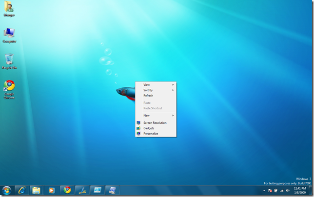
Few interesting things – for me – the wall paper looks awesome – a fish floating on the desktop.

Notice the build number, since it is BETA. The installation keys are not available on the MSDN subscribers page at the time of this writing, so I have not yet activated my copy of Windows.
Startup, Shutdown and Restart
Start-up was fast – much faster than what Vista gave me. Moreover, I enabled the option to use both the cores on my machine during the BOOT process (using msconfig). I think it has decent effect on the boot performance. I wanted to try No Gui Boot but haven’t had the heart to take the risk.
Shutdown – I initially had few issues shutting the system down. It was not responding for a while, but the last few times I tried, it went on smooth. I think it has to do something with me starting the machine up in safe mode and then restarting the machine. But when it works, it is fast.
Restart – pretty fast.
New Taskbar
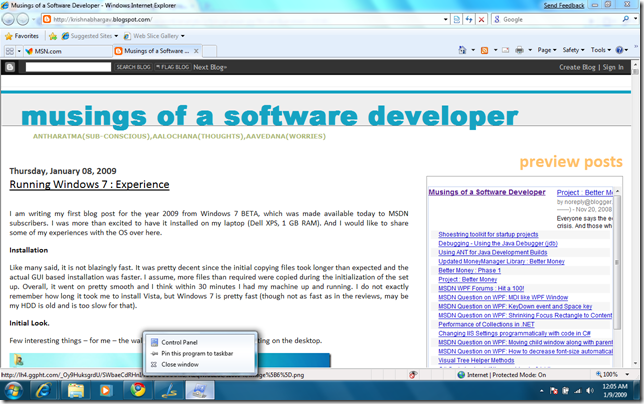
The new taskbar has a lot of feel. I think the taskbar is moving towards the OS X style but the difference is that the taskbar is 100% of the width in the Windows 7. The shortcut WIN + T, gives a nice summary of windows on your desktop, just above the taskbar. You can maximize a window by pressing Win + Up Arrow or by simply moving the window to the top of the screen. This is more of an easter egg than intuitive.
Also in the image, you can see the list of new shortcuts for windows 7. Quick Launch is gone and is replaced with the task bar itself where you can pin your applications. On my task bar, the first one is IE, so WIN + 1 launches IE. This, I think, would be very useful once we get the feel of the shortcuts. The window arrangement is pretty sweet too – OS X like feature to hide all windows by moving the mouse to the bottom right corner and brining up the gadgets (this actually sets transparency of the windows to 0, so they are invisible and if you have any gadgets, they appear). The Show Desktop is now the little rectangle very next to the time. Click that button, you get your desktop.
Start menu
The start menu also behaves differently. Applications can also be pinned to start menu (just like in the case of task bar)
Notice the Pin to Taskbar and Pin to Start Menu options in the context menu of the files.
Notice the Context Menu has changed – it is now more like a preview window than context menu. You can also pin a window to task bar from here.
Powershell ISE
Great news for geeks is that Powershell along with the new IDE (Powershell ISE) comes pre-installed. The Powershell ISE is very good and I believe it is WPF based, given its smooth zooming functionality (Ctrl + +). Zoomed ISE is shown below.
You can run powershell commands as well as write PS scripts. It has debugging capabilities too. I remember seeing something like in PowerGUI or not sure if it is the same one that I saw few months back. But this tool looks promising.
Mounting ISO
I tried to make Daemon Tools work on Windows 7 but the SPTD driver that is required does not get installed on Windows 7. So I installed Virtual CloneDVD. Initially even this did not work – the software got installed successfully but failed to show any new drives inside the Explorer. But after I rebooted the machine into SAFE MODE, I could see the new drives added. Then I switched back to normal boot and it worked.
Installing Visual Studio 2008 SP1, Silverlight on Windows 7
I had no issues with installing the VS 2008 SP1, Resharper 4.1, Silverlight 2 Runtime and PowerCommands. So far, things are working as expected.
Themes
There are new theme packs to change the looks of the windows shell. Not all are up to my taste, so I decided to stick with the default one. But there are some good themes, if you did like to try.

The context menu on the desktop now includes Screen Resolution option.
Wireless
The Wireless settings were taken care at the beginning of the set up and it has been very good so far. The wireless repair, I read, is repaired automatically, if required.
UAC
The UAC is still on by default but the better news is that it does not block you from using other programs, if there are any running. It shows a shield like icon in the task bar and you get the UAC prompt when you click that. This is way better than the previous one in Vista.
ReadyBoost
ReadyBoost – using Flash Stick as paging cache to speed up paging is still present. I haven’t actually tried it to see if it made it any better.
Connecting to a projector
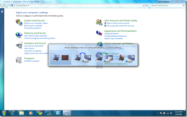
The image below shows the options (Win + P) and it looks sweet. This is way better and I am not sure if it is already present in Vista (haven’t used it before). Since I connect my machine to my HDTV, this is a really cool discovery for me.
Ribbon UI
Ribbon based UI, the one that came with Office 2007 is not everywhere. By this I mean, explorer does not have ribbon UI but Paint and Wordpad sure does.
Calculator
Calculator is improved – two more modes added (Programmer, Statistics). The Options are increased and shown in the image is the templates option. More on calculator later.
ANNOYANCES
There are some areas which I think needs certain improvements.
1. The wireless status icon color is deceiving. The color contrast between connection level and no connection is not good enough and when the connection is 100%, the icon appears as if there is no connection.
2. The shutdown that failed – it almost made my heart skip. I removed my Vista install, the one which I used for over 1.5 year to use this. So i was worried.
3. The taskbar is good but it does not display any text or name of the application. If you want to see the text, then you need to hover on the icon. I like visual information but little text would sometimes make more sense than the icons – at least in the beginning. Not many of us remember the icons of rarely used programs.
4. For some reason, my external HDD did not show up in the explorer when I connected it for the first time, during the first boot. It just worked fine from the next boot. No clue on why it happened.
OVERALL – 4/5
Excepting the annoyances listed, the experience so far is very good. The UX is improved vastly though most of the UI looks like Vista, it is the feel that has changed drastically. My system rating was 2.0 given my age old HDD on the laptop but on a 1 GB machine, the OS is very fast and I feel it is even better than XP. Performance is good – starts up fast, shuts down fast, reboots fast – that is great news for others, for me it does not matter since I hardly shut down my laptop. Users versed with Vista would find no issues working around the UI since the UI principles are the same. And since I liked it, I consider Windows 7 (even the BETA) to be worthy of trying out.
Though, the post is not exactly descriptive, I tried to show as many images as I can. I hope to cover more details in subsequent posts.


No comments:
Post a Comment