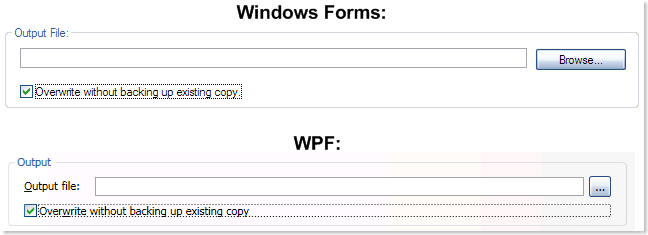
http://social.msdn.microsoft.com/Forums/en-US/wpf/thread/9c8b6e75-6970-4126-89ac-40dc6ca39b43
The requirement is that a Checkbox inside a grid, when gains focus should have its focus rectangle fit to the content, just in the WinForms example.
The XAML for the solution is shown below.
<Grid >
        <Grid.RowDefinitions>
            <RowDefinition Height="Auto" MinHeight="13" />
            <RowDefinition Height="Auto" MinHeight="13" />
        </Grid.RowDefinitions>
        <Grid.ColumnDefinitions>
            <ColumnDefinition />
        </Grid.ColumnDefinitions>
        <CheckBox HorizontalAlignment="Left" Grid.Row="0">Content will be put here</CheckBox>
        <CheckBox Grid.Row="1">Content would be put here again, another test checkbox</CheckBox>
    </Grid>
The idea is to set HorizontalAlignment of the focusable controls to Left which makes the Grid layout consume extra space only as needed instead of taking it on whole. The screen shot of running application is shown below.

Hope this helps. By the way, the first screen shot has been pulled from the link I specified. If the author of the post happens to stumble upon this post and finds it offensive, I can remove the screen shot. I just did not want to spend time developing two prototypes showing just the issue when there was already a great screen shot available.

No comments:
Post a Comment